Table of Contents
You’ve done the hard part—creating a great product. But when a potential customer lands on your product detail page and gets lost in unclear descriptions, low-quality images, or a clunky layout, they’re gone before you can even make your pitch. Your product might be top-notch, but without a well-designed product detail page, your visitors may never realize it.
When shopping online, the product detail page (PDP) is where customers make their buying decisions. It’s the place where you can tell everything about your product—the features, benefits, images, and more. A well-designed PDP can make a huge difference in whether a visitor becomes a buyer or just browses through and moves on.
A winning product detail page is like having a top salesperson on duty 24/7. It shows what’s great about your product, answers your customers' questions before they even ask, and makes buying feel easy and natural. In this article, we’ll break down how to design a product detail page that not only informs but actually converts visitors into loyal customers.
What is a Product Detail Page?
A product detail page is essentially the digital storefront for each product you sell. It’s where you provide all the information potential buyers need, including descriptions, visuals, pricing, and even customer reviews. Think of it like this: if a customer walks into a physical store, they want to touch and inspect the item, maybe ask the salesperson a few questions before they decide. Since they can’t do that online, the PDP acts as their go-to source for all those details.
A well-designed product detail page is made up of several key components that work together to inform, engage, and ultimately convert visitors into customers. Here are the essential parts of a great product detail page:
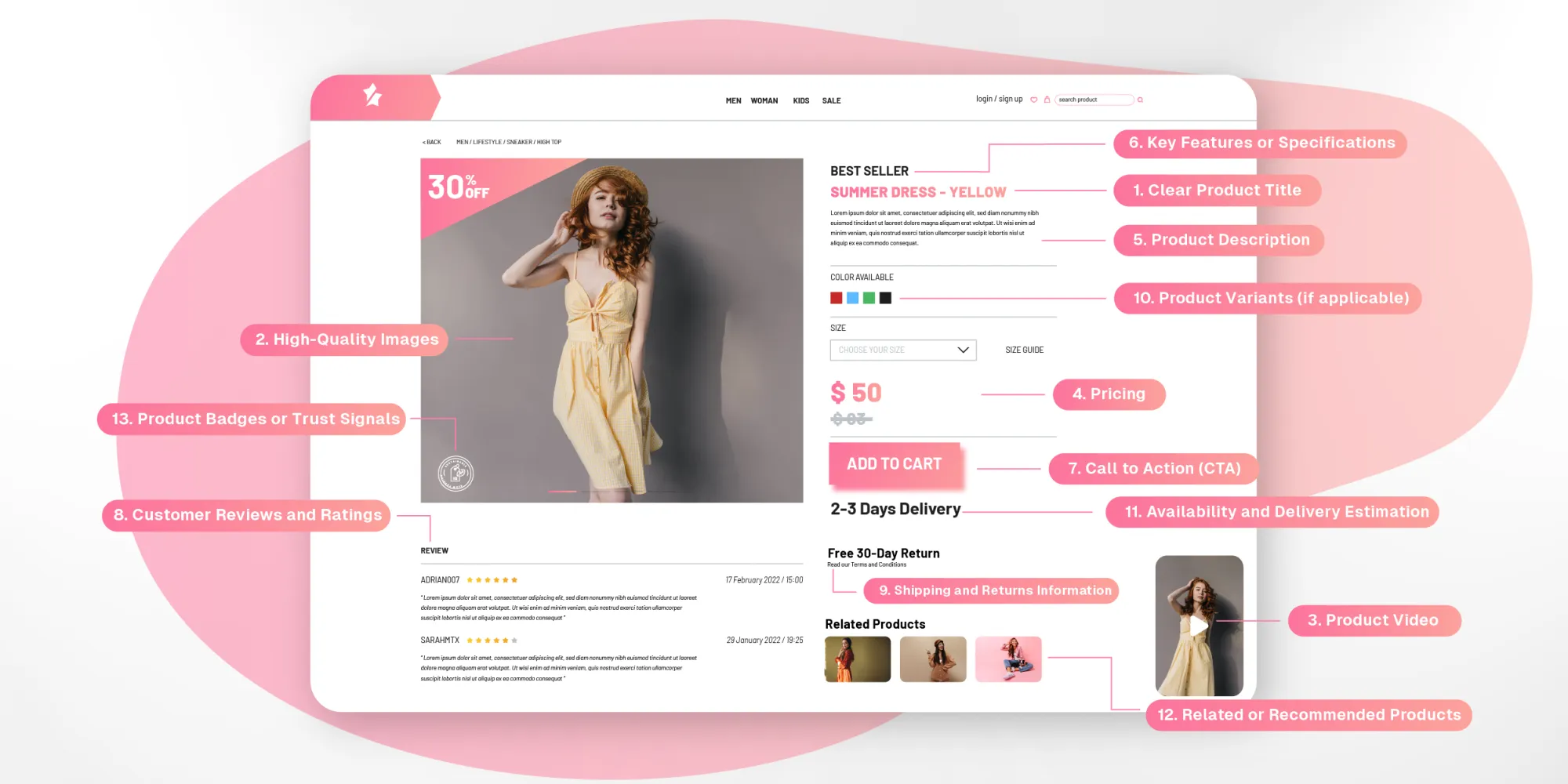
1. Clear Product Title: The title is the first thing customers see, so it needs to be clear and straightforward.
2. High-Quality Images: Multiple high-resolution images from different angles that allow customers to examine the product closely, especially with zoom functionality.
3. Product Video: A product video can help customers see the product in action, demonstrating how it’s used or highlighting its features in real life. Some brands incorporate shoppable videos, allowing users to interact with and purchase the product directly from the video.
4. Pricing: Clearly display the product’s price, along with any discounts, promotions, or payment options.
5. Product Description: A concise and engaging description should focus on both features and benefits, explaining how the product will improve the customer’s life.
6. Key Features or Specifications: List out the product’s main features or technical specifications, especially if it’s a product where these details matter, like electronics or clothing.
7. Call to Action (CTA): This is where you encourage the customer to take action, typically by clicking “Add to Cart” or “Buy Now.”
8. Customer Reviews and Ratings: Social proof is powerful. Display customer reviews, star ratings, and testimonials to build trust and give potential buyers a sense of what others think about the product.
9. Shipping and Returns Information: Shipping costs and return policies directly on the PDP gives customers peace of mind and removes uncertainty, reducing abandoned carts.
10. Product Variants (if applicable): If your product comes in different sizes, colors, or configurations, make it easy for customers to select the variant they want. This section should be user-friendly and allow for quick comparisons.
11. Availability and Delivery Estimation: Let customers know if the product is in stock, out of stock, or available for pre-order. Also, include an estimated delivery time, especially for international customers or if offering multiple shipping options.
12. Related or Recommended Products: Including a section for related or recommended products can help increase average order value by encouraging customers to browse other options or complementary products.
13. Product Badges or Trust Signals: Display any badges or certifications that signal trust, such as “Best Seller,” “Eco-friendly,” “Free Shipping,” or customer satisfaction guarantees.
Each of these parts works together to create a seamless and informative experience that helps guide the customer toward making a purchase with confidence.
Why is it important for your business to have a Product Detail Page?
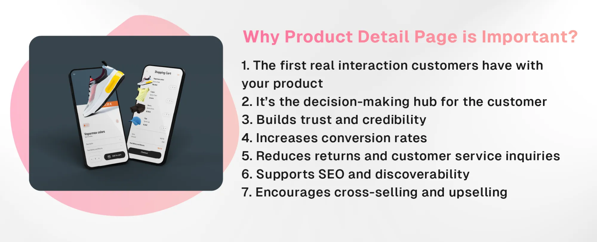
A product detail page (PDP) is one of the most crucial elements of an online store because it serves as the final touchpoint between a customer’s interest and their decision to buy. Here’s why a great PDP is so important:
1. First impressions matter
For many customers, the product detail page is the first real interaction they have with your product. It’s where they’ll decide if what you’re offering meets their needs or solves their problem. A cluttered, unclear, or poorly designed page can create doubt and lead them to leave without making a purchase.
2. It’s the decision-making hub
The PDP provides all the information a customer needs to make a purchase decision. From product descriptions and images to reviews and pricing, everything essential is there. A well-designed page answers the buyer’s questions upfront and guides them smoothly toward buying with confidence.
3. Builds trust and credibility
A polished, professional PDP builds trust with customers. High-quality visuals, clear descriptions, and honest customer reviews show that you care about transparency and quality. Including detailed shipping and return information further reassures customers that they’re making a safe purchase.
4. Increases conversion rates
The goal of any product page is to convert visitors into buyers. A well-optimized PDP boosts conversion rates by providing the right mix of visuals, information, and user-friendly design. It reduces confusion, answers questions, and makes the buying process as easy as possible.
5. Reduces returns and customer service inquiries
By providing detailed product information, including specs, dimensions, and materials, the PDP ensures that customers know exactly what they’re buying. This reduces the likelihood of returns due to mismatched expectations and cuts down on customer service tickets asking for more details.
7. Supports SEO and discoverability
A well-structured PDP with relevant keywords, clear product descriptions, and proper metadata also helps improve your site’s SEO. This makes your products easier to discover on search engines, driving more organic traffic to your site.
8. Encourages cross-selling and upselling
A strategically designed PDP can highlight related products or offer additional items that complement the one a customer is viewing. This can increase your average order value by encouraging buyers to explore and purchase more.
In short, the product detail page is where interest turns into action. It's a key part of your online store that helps inform and convince shoppers to make a purchase. At the same time, it builds trust and makes the buying process smooth and easy.
How to design a great Product Detail Page
Now that we’ve established what a PDP is, let’s look at how you can create a winning page that not only informs but also converts.
1. Have a clear product title and description
Start with a product title that is simple and descriptive. Your customer should immediately know what the product is. Follow that with a description that speaks to your audience in a relatable way. Focus on the key details they care about without overloading them with unnecessary jargon. For example, if you’re selling a jacket, tell them about the fabric, the fit, and any unique features that set it apart.
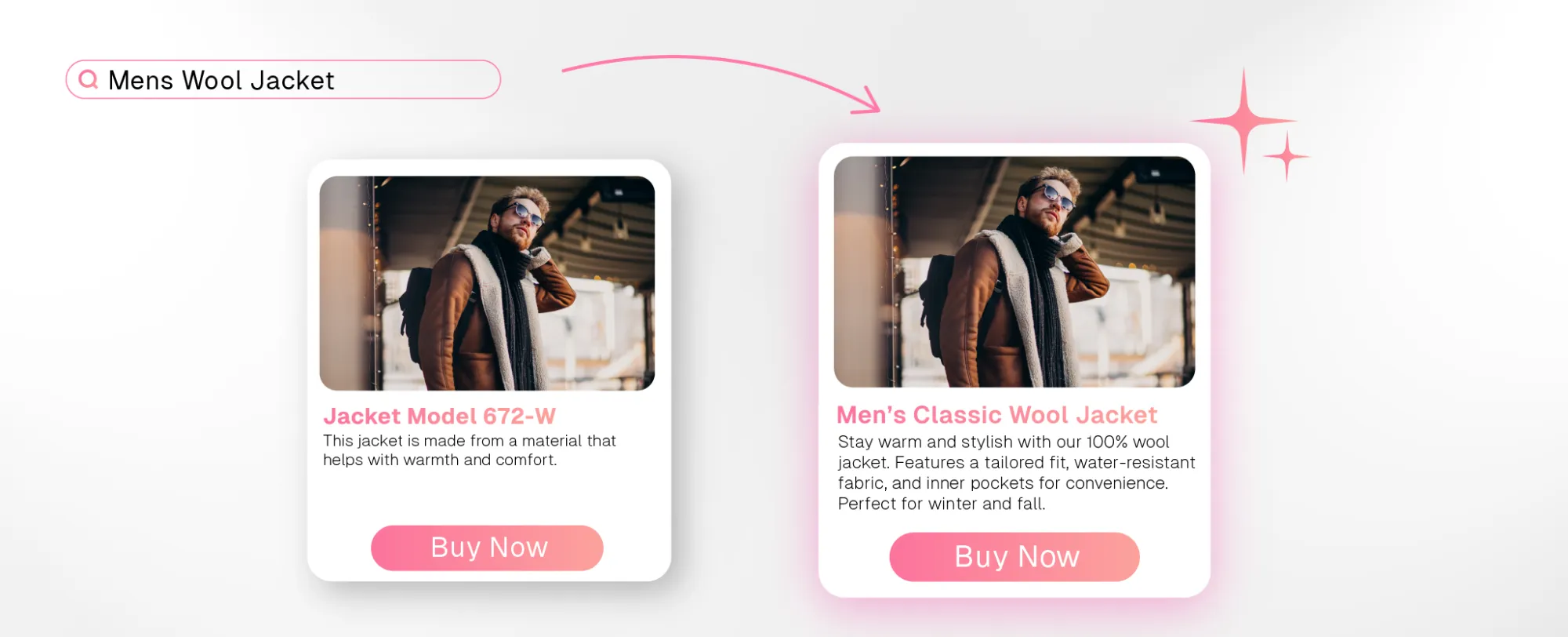
Why it’s good: The good example clearly states what the product is and provides a concise, engaging description that speaks to the benefits. The bad example uses a vague title and a generic description that doesn’t provide enough information or a strong reason to buy.
2. Use high-quality images and videos
Visuals are one of the most important parts of your PDP. Customers can’t hold the product in their hands, so they rely on images and videos to get a feel for it. Make sure you have high-quality images from multiple angles, and add videos to show the product in action.
A subtle way to elevate the experience is by using videos that allow customers to engage directly with it. For instance, a short clip of a model wearing that jacket, where customers can click on specific features like the zipper or pockets to learn more. These interactive video elements can be seamlessly integrated, offering a richer experience without being too in-your-face.
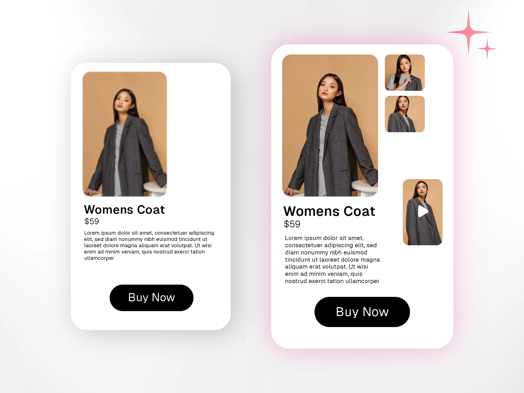
Why it’s good: The good example allows customers to inspect the product from all angles and see it in action, while the bad example provides minimal visual information, making it hard for customers to imagine the product.
3. Highlight key features and benefits
Customers don’t always have time to read long paragraphs, so make the key features and benefits easy to spot. Use bullet points or short sections to highlight what makes your product special. For example, if you’re selling a tech gadget, talk about the battery life, ease of use, or any standout functionality. Keep it clear and concise.
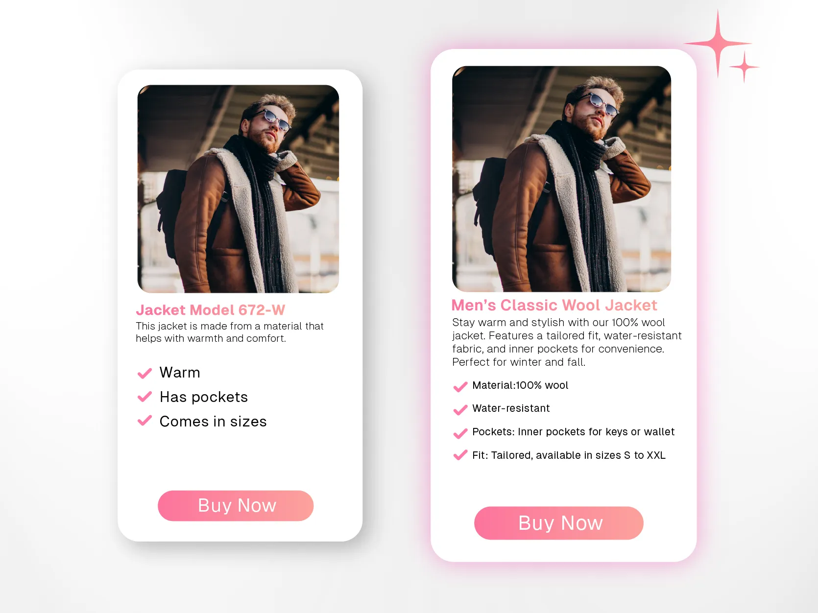
Why it’s good: The good example is specific, using short bullet points that clearly explain key product features and benefits. The bad example is vague and leaves the customer guessing.
4. Use social proof: reviews and testimonials
Buyers trust the experiences of others, so make sure to include customer reviews and ratings on your PDP. Showing what other people think of your product helps build credibility. And it’s not just about showing perfect reviews—customers appreciate transparency, so displaying a mix of positive and constructive feedback can actually enhance trust. A PDP without reviews can feel incomplete, while real feedback adds depth and confidence.
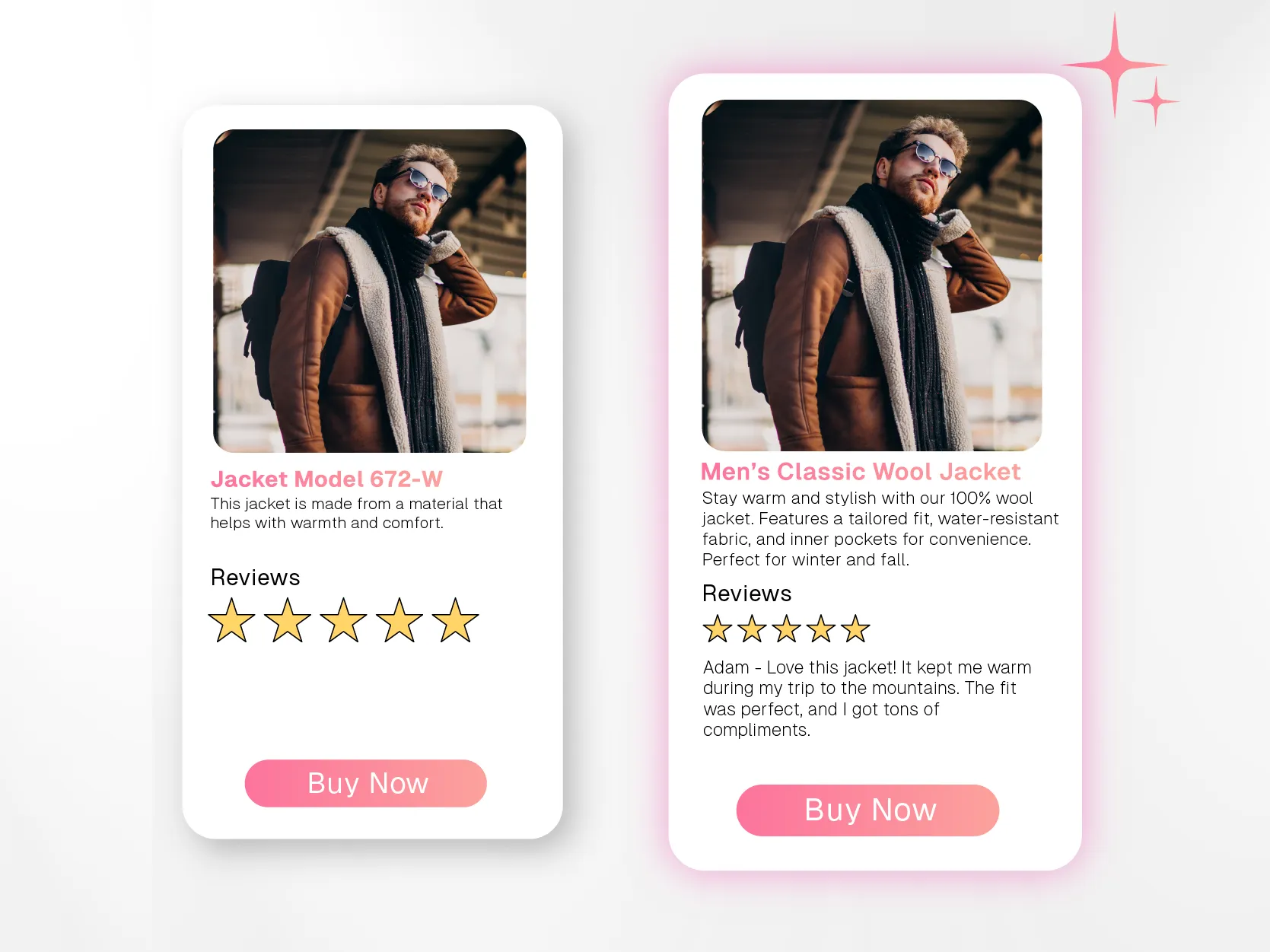
Why it’s good: The good example provides a detailed, positive review that helps build trust with potential customers. The bad example lacks valuable feedback, making the product seem unproven.
5. Clear and visible Call-to-Action (CTA)
The "Buy Now" or "Add to Cart" button should be easy to find but not too pushy. Place it where customers can quickly spot it without feeling like they’re being forced into making a purchase. A well-placed, subtle CTA can help guide customers without disrupting their experience.
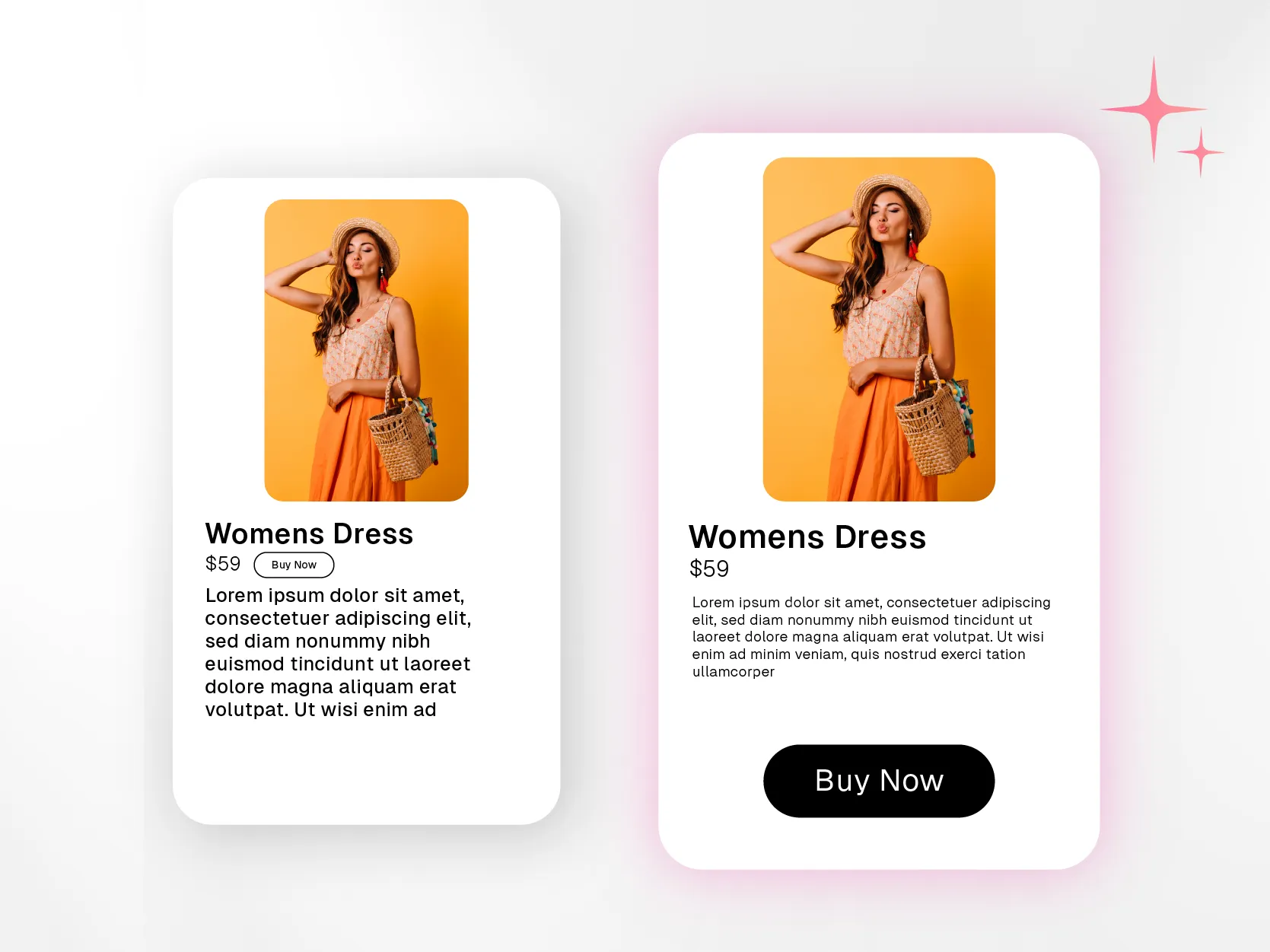
Why it’s good: The good example makes the purchase process simple, with a clear CTA. The bad example buries the CTA, making it harder for the customer to take action.
6. Have a simple, easy-to-navigate layout
Nobody likes a cluttered page. Keep the layout clean, with enough white space to let your product shine. Break up text into small, readable chunks, and use images to complement the descriptions. An uncluttered PDP helps the customer focus on the product, rather than feeling overwhelmed by information.
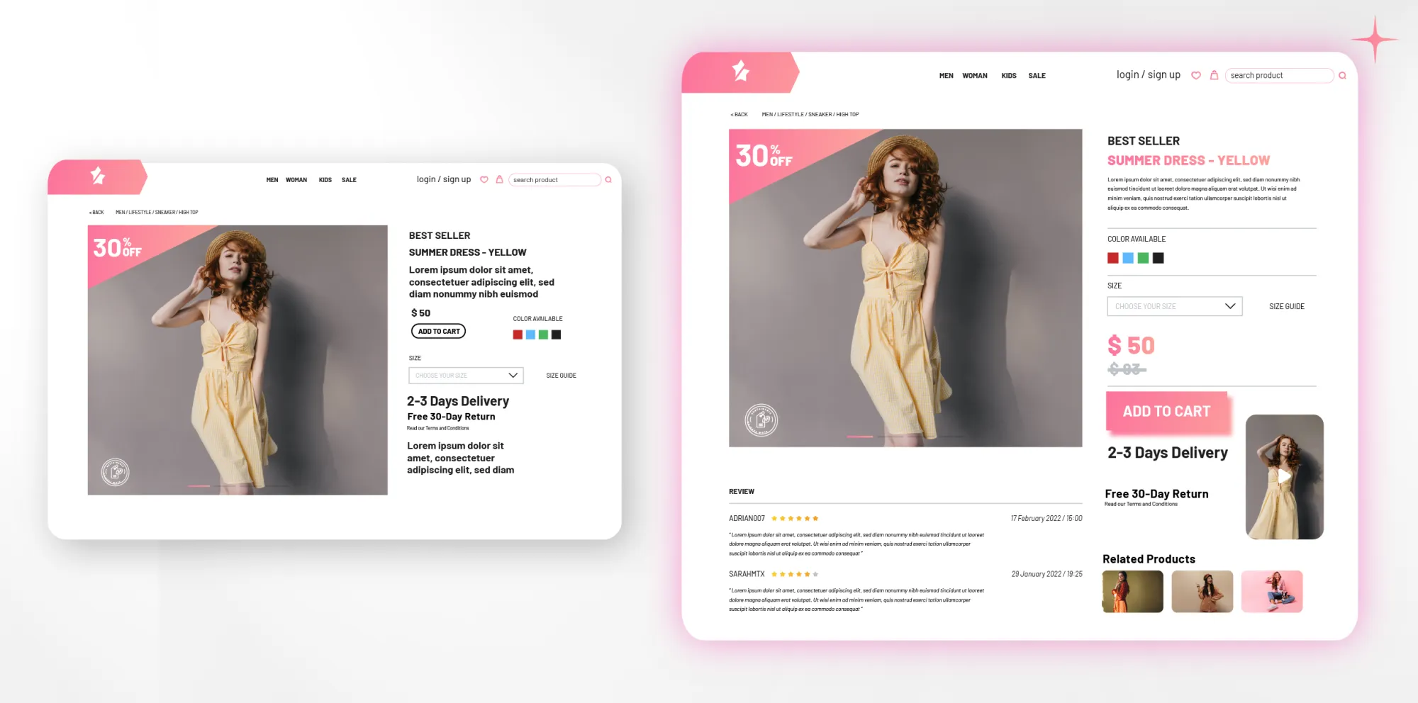
Why it’s good: The good example is clean and easy to navigate, allowing customers to find what they need quickly. The bad example overloads the page with information, frustrating the customer.
7. Detailed specifications should be in a digestible format
Some products require a bit more detail, especially if they are technical or come in various sizes and specifications. Present this information clearly—tables can be a great way to organize specs like dimensions, materials, or power requirements. For example, if you're selling furniture, include a simple table that breaks down the height, width, depth, and material in a quick glance.
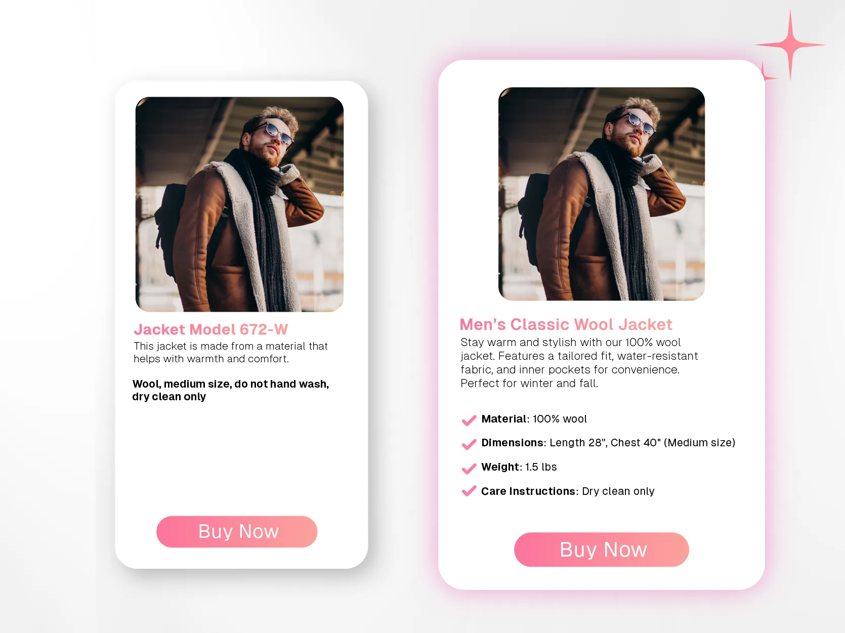
Why it’s good: The good example presents specs in a clear, organized format, making it easy for customers to understand details at a glance. The bad example lacks key details and is hard to follow.
8. Ensure the page is optimized for mobile
More and more people are shopping on their phones, so make sure your PDP is fully optimized for mobile devices. All images, text, and buttons should adjust seamlessly to different screen sizes, ensuring the same smooth experience whether on a phone or a desktop.
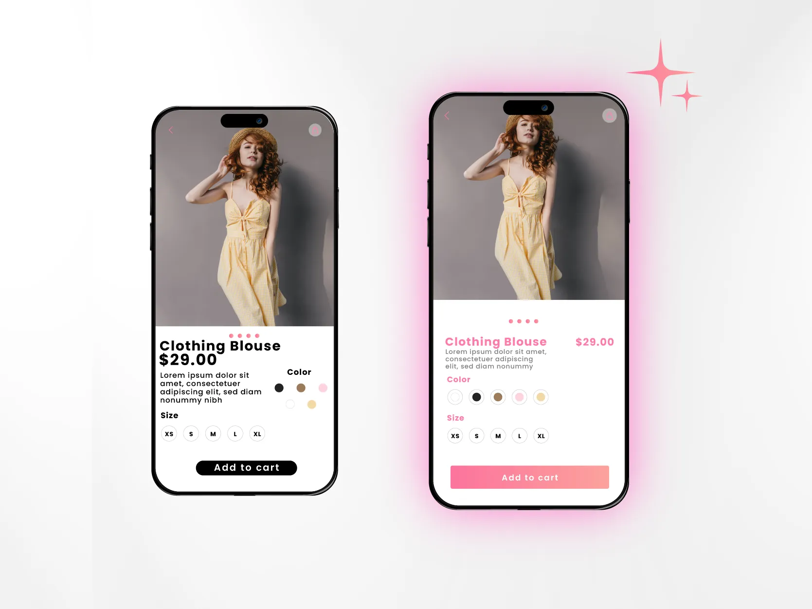
Why it’s good: The good example provides a smooth mobile experience, important for on-the-go shoppers. The bad example frustrates mobile users, potentially driving them away.
9. Shipping and returns info
Customers appreciate knowing the details about shipping and returns before they buy. Be upfront with this information, and include it in a visible area on the PDP, whether it’s in a dedicated section or alongside the product price. This removes any last-minute surprises and makes the shopping process feel more transparent.
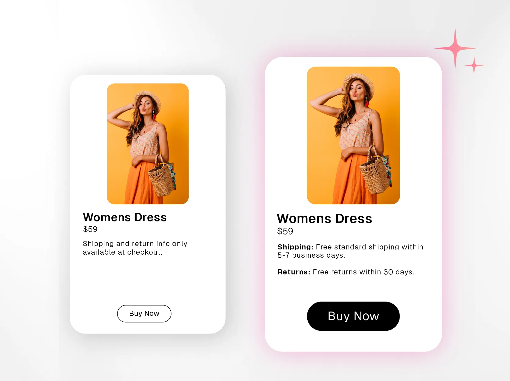
Why it’s good: The good example provides clear shipping and return information directly on the product page, building transparency and trust. The bad example forces customers to search for this information or wait until checkout, which can lead to abandoned carts.
By following these simple tips, you’ll create a product detail page that’s not only visually appealing but also easy for your customers to navigate. The key is to make sure they have all the information they need to feel confident about their purchase. When your page is clear, easy to use, and answers their questions, you’re building trust and making it more likely they’ll hit “Add to Cart.”
At the end of the day, a great product detail page doesn’t just showcase a product—it helps create a smooth, hassle-free shopping experience.
Great Product Detail Pages to inspire yours
When it comes to designing a great product detail page, sometimes the best way to learn is by seeing what others are doing right. Let’s take a look at the examples of Product Detail Pages of some brands that not only look great but also help turn curious shoppers into happy customers.
1. Apple AirPods
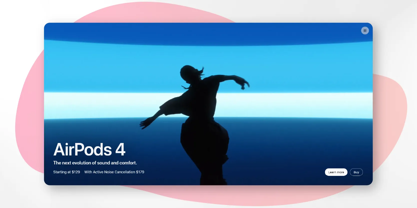
Apple AirPods product pages are a masterclass in simplicity and clarity. They use clean, high-quality visuals, paired with clear descriptions and product specs. They also seamlessly blend in interactive elements, like allowing you to rotate the AirPods in 3D.
The page stands out for several reasons:
- The layout is clean, with plenty of white space, making it easy to focus on the product without feeling overwhelmed by unnecessary information.
- The page includes sharp, high-quality images of the AirPods from multiple angles, allowing customers to get a close look at the design. Apple also uses videos to show how the AirPods work in everyday scenarios, helping buyers visualize the product in use.
- The product description highlights the key features of the AirPods, such as battery life, seamless device pairing, and sound quality, without overwhelming the reader. The information is laid out in a way that’s easy to digest and focuses on the benefits, making it relatable for both tech-savvy customers and everyday users.
- Apple includes interactive elements like scrolling animations and sections that expand with more details, making the browsing experience more engaging without being overly complicated.
- Customer reviews and ratings are featured prominently, adding a layer of trust by showcasing what real users think of the product.
- The “Buy” button is visible but not intrusive, and the navigation is straightforward, guiding users through all the information they need before making a decision.
Overall, Apple’s AirPods product detail page is a great example of how to balance design, functionality, and information to create a seamless shopping experience.
2. Nike running shoes
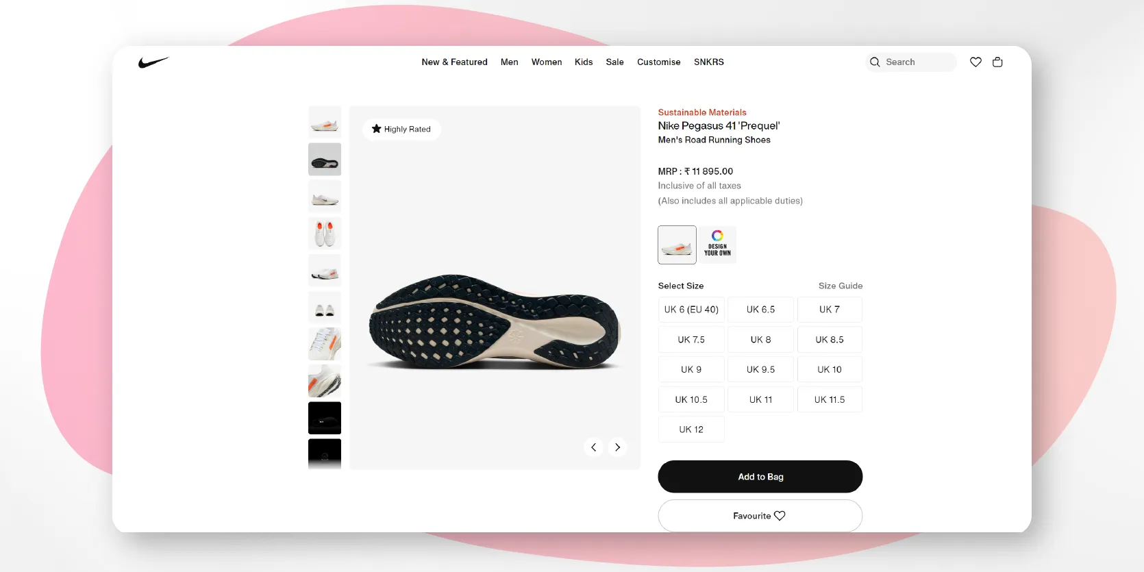
Nike’s Product Detail Pages shine with action-packed imagery and videos that show their products in real-world scenarios. This gives customers a feel for how the shoes will perform, and the interactive images let them zoom in on specific details, like the sole or laces.
Here’s why they work:
- High-quality visuals: Multiple images and action shots let customers see the shoes in real-world use, and the zoom-in feature helps showcase details like the material and sole.
- Clear product information: Nike highlights key features like breathability and cushioning, using simple, relatable language that explains how the shoes will enhance performance.
- Engaging videos: Short videos demonstrate the shoes in action, helping customers imagine how they perform during runs.
- Interactive size guide: Nike’s detailed size and fit guide ensures customers can confidently pick the right size.
- Social proof: Customer reviews and ratings build trust by showcasing real-world feedback.
- Prominent CTA: The “Add to Cart” button is prominent, guiding customers smoothly to purchase.
In short, Nike’s PDP strikes the right balance of visuals, information, and user-friendly design, making the shopping experience seamless and enjoyable.
3. Charmacy World
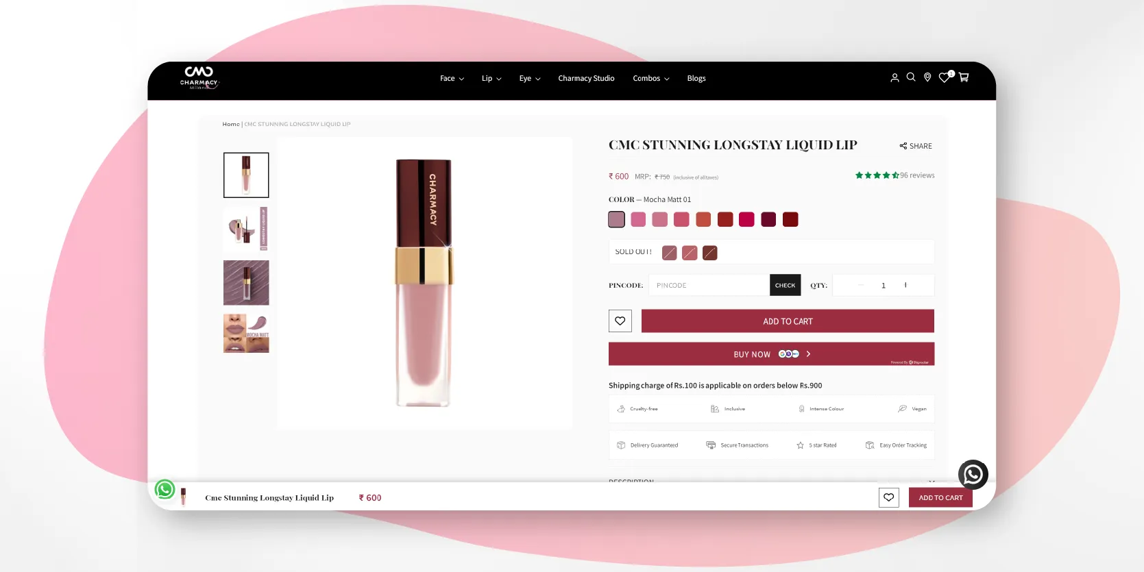
Charmacy World is a vibrant beauty brand known for its high-quality, long-lasting products that combine bold colors with innovative formulas, designed to make beauty accessible and fun for everyone.
Charmacy World’s product detail page is a fantastic example of a well-executed PDP. Here’s why it stands out:
- Vibrant, high-quality images: Bold, clear images showcase the lipstick’s shades and packaging, giving customers a detailed look at the product.
- Shoppable videos: The page includes shoppable videos that allow customers to see the product in action and make a purchase directly from the video, enhancing the shopping experience without being too pushy.
- Clear product information: The description highlights key features like long-lasting wear, high pigmentation, and smooth application, helping customers quickly understand the product's benefits.
- Color swatches and options: Clickable color swatches make it easy for customers to browse and choose their perfect shade.
- Customer reviews: Reviews and ratings are clearly visible, offering valuable social proof to build trust.
Charmacy World’s page effectively combines shoppable videos, engaging visuals, and clear information to create a seamless, enjoyable shopping experience for customers.
4. Warby Parker Glasses
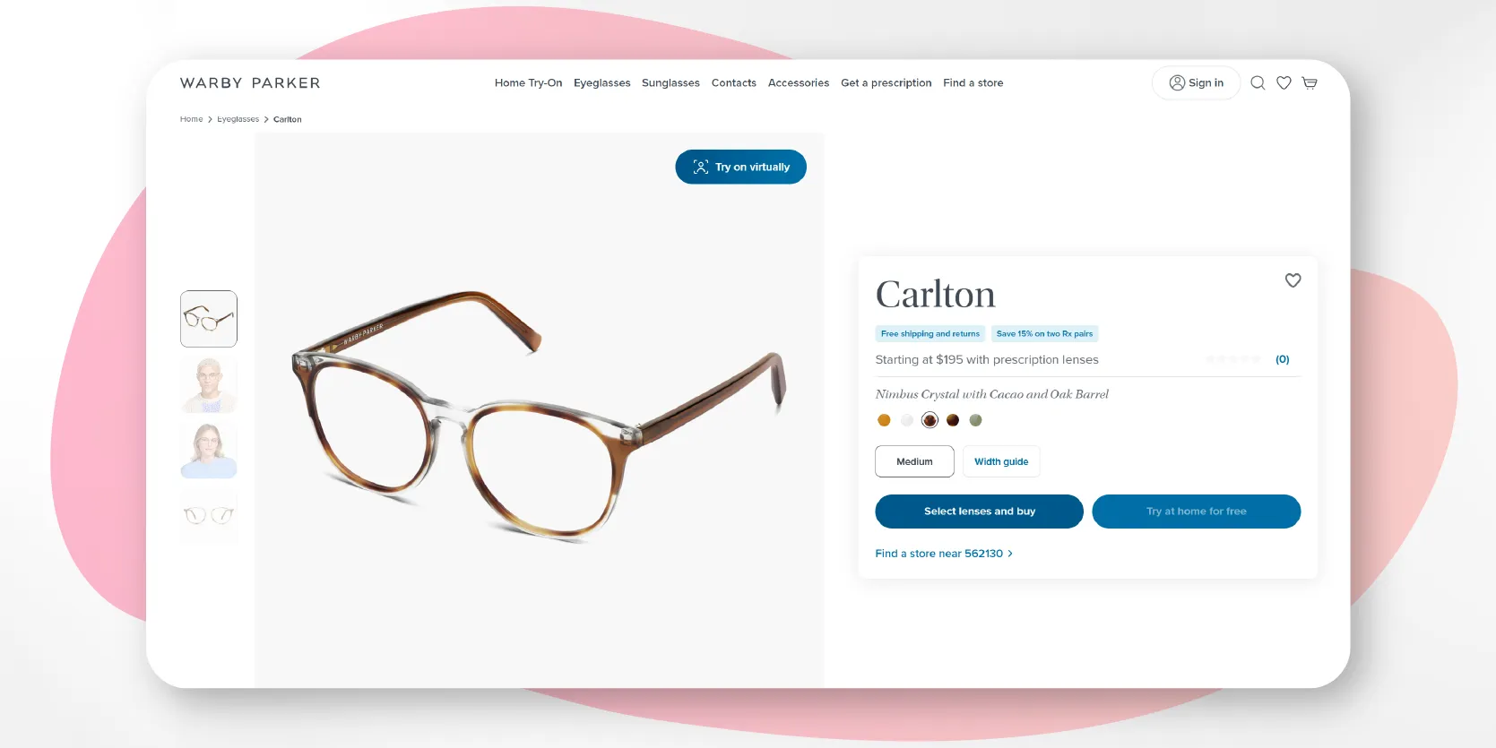
Warby Parker does a great job making their PDPs personal by adding a virtual try-on feature. Customers can see how the glasses would look on their face before making a purchase, which is super handy for a product where fit is essential.
Here's what works in this page:
- Clean design: The page is simple and easy to navigate, keeping the focus on the product.
- High-quality images: Multiple angles and model shots help customers visualize the glasses.
- Virtual Try-On: The interactive tool lets customers see how the glasses look on their face, making online shopping more personal.
- Detailed info: Key product details and FAQs are clearly listed.
- Customer reviews: Social proof from reviews builds trust.
- Easy CTA: The “Add to Cart” button is prominent and user-friendly.
Overall, Warby Parker’s page offers a smooth and engaging experience that helps customers confidently make a purchase.
5. Superbottoms
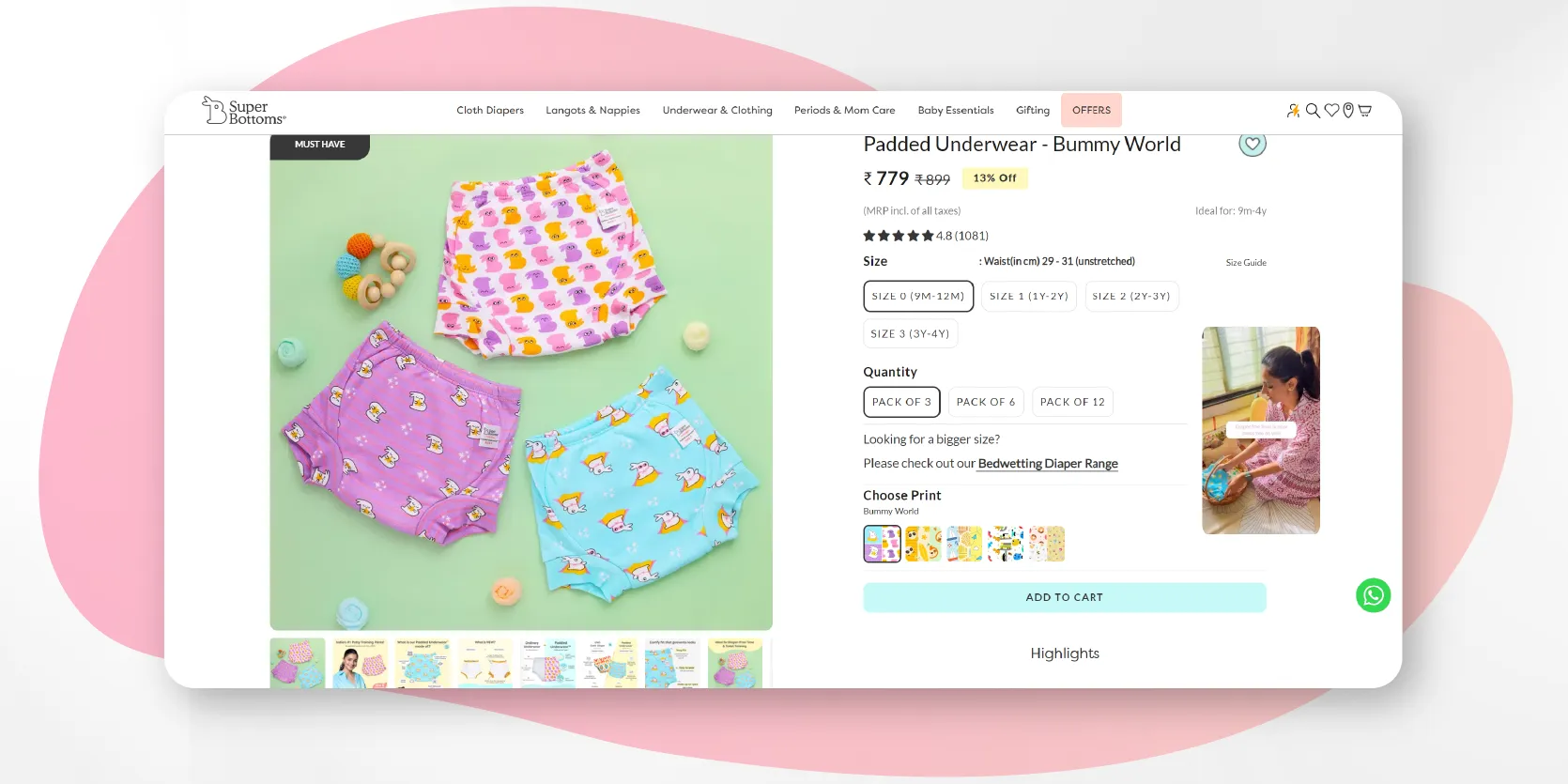
SuperBottoms is a trusted brand specializing in eco-friendly, comfortable, and innovative baby products, designed with the well-being of both children and the planet in mind.
Their product detail page is a great example of a well-structured, informative, and user-friendly shopping experience. Here’s why:
- High-quality images: The page features multiple clear images of the product, showcasing various angles and patterns, helping parents visualize what they’re buying for their child.
- Detailed product information: The description focuses on important details like softness, absorbency, and child-friendliness, addressing exactly what parents need to know when choosing padded underwear for their little ones.
- Interactive size guide: The page includes an easy-to-use size guide, which helps parents select the correct size, ensuring a better fit and reducing the chances of returns.
- Customer reviews: The customer reviews and ratings build trust, especially for parents looking for reliable, child-safe products.
- Engaging, colorful design: The playful design of the page matches the brand's focus on baby products, making the page feel inviting and fun.
SuperBottoms’ page effectively combines informative content, strong visuals, and a family-friendly design, creating a seamless shopping experience for parents.
Best practices to follow for great product detail pages
Designing a product detail page that converts visitors into buyers requires careful planning and attention to detail. Let’s walk through some best practices that will ensure your PDP is both user-friendly and optimized for sales.
1. Focus on User Experience (UX)
Your product page should be designed with the customer’s needs in mind. Make navigation simple and intuitive. Information should be easy to find, and the layout should be clean, with plenty of white space to avoid overwhelming the viewer.
Tip: Group related information together—such as images, descriptions, and specifications—so customers can find what they’re looking for quickly. Prioritize essential details like product features, pricing, and reviews near the top of the page to catch attention early.
2. Highlight product benefits over features
While it’s important to mention technical specifications, customers are usually more interested in how the product will benefit them. Focus on the user experience and real-life advantages the product offers.
Tip: Instead of simply listing "Waterproof material," emphasize how it helps the customer: "Stay dry even in heavy rain, thanks to the durable waterproof material."
3. Do not miss out on adding the social proof
Displaying customer reviews, testimonials, or user-generated content can significantly impact buying decisions. People trust the experiences of others, so showcasing real feedback will build credibility and trust.
Tip: Include star ratings and reviews right below the product title or near the “Add to Cart” button. Feature a mix of positive and critical reviews, and highlight testimonials that mention specific benefits or uses of the product.
4. Make CTAs stand out
Your "Add to Cart" or "Buy Now" button should be easy to locate and stand out on the page. However, it should fit naturally into the design without being overly aggressive or distracting from the rest of the content.
Tip: Use contrasting colors that draw attention to the CTA but don’t clash with your brand’s overall color scheme. The wording should be simple and action-oriented, like “Add to Cart” or “Buy Now,” without sounding too pushy.
5. Keep load times fast
A slow-loading product page can frustrate customers and lead to higher bounce rates. Ensure that all images are optimized for fast loading without sacrificing quality. No one wants to wait for a page to load—especially when there are so many other options available online.
Tip: Compress images, use proper caching, and ensure your website infrastructure is optimized to handle high traffic. You can test load times using free online tools to ensure your page performs well.
A well-designed PDP is one that puts the customer first, offering all the information they need in a way that’s both clear and engaging.
In summary, Creating a winning product detail page is more than just showcasing your product—it’s about delivering an experience that builds trust, answers questions, and makes buying easy and enjoyable. The key is to focus on clarity, high-quality visuals, and customer confidence.
A great PDP not only highlights the best of your product but also shows customers that their shopping experience matters. With these best practices in hand, you’re ready to transform browsers into loyal customers, one click at a time.
Using Whatmore.ai can give you a significant edge when designing a great product detail page. With its AI-powered product content generation capabilities, Whatmore helps you create rich, engaging shoppable videos effortlessly—give it a try!
